iOS 17 brought a bag of new goodies in SwiftUI. Among them, the new ContentUnavailableView. It allows us to present an empty state to the user without having to create custom error views.
It’s easy to use, customizable, and has a pre-defined view for an empty search state.
It’s recommended to be used in situations where a view’s content cannot be displayed. This could be due to a network error, a list without items, a search that returns no results and other empty states.
Let’s see it in action.
Empty search state
Search is a common feature in a lot of apps. Presenting an error screen while the user is typing is a good user experience. Never keep your user’s wondering about the current state of the app.
It’s so common, that we got a custom search instance of the ContentUnavailableView.
struct ContentView: View {
    @State private var viewModel = ViewModel()

    var body: some View {
        NavigationStack {
            List {
                ForEach(viewModel.searchResults, id: \.self) { fruit in
                    NavigationLink {
                        Text(fruit)
                    } label: {
                        Text(fruit)
                    }
                }
            }
            .navigationTitle("Fruit")
            .searchable(text: $viewModel.searchText)
            .overlay {
                if viewModel.searchResults.isEmpty {
                    // Search unavailable view
                    ContentUnavailableView.search(text: searchText)
                }
            }
        }
    }
}
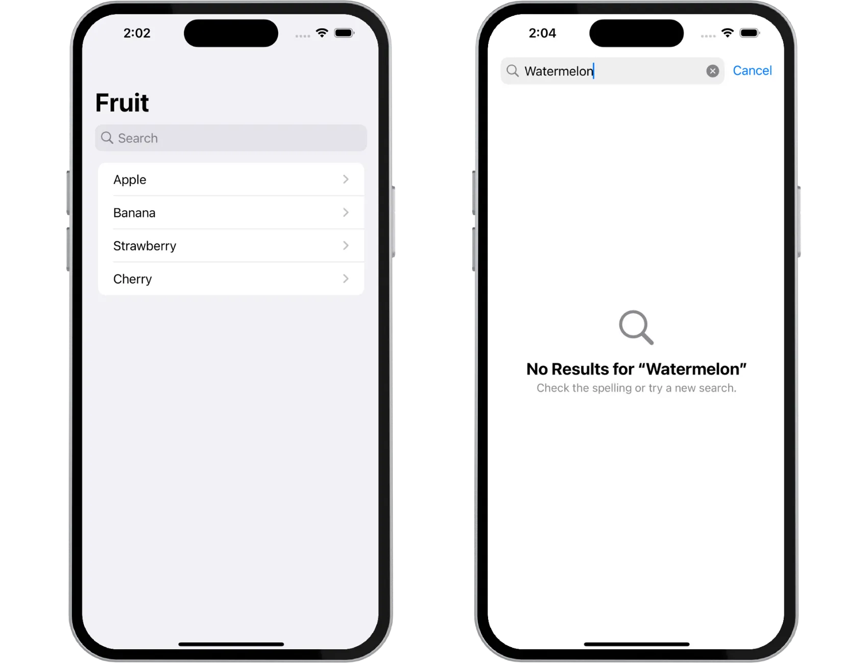
Add the empty search state with ContentUnavailableView.search(text: searchText). It has an optional search text parameter that shows the search text that the user entered.
Add it as an overlay on the List while the user is typing and if search is returning no results.

It looks great! No need to create custom error views anymore. It adds a system image and a default description for you.
Custom empty states
We can also create custom unavailable views with any custom view or a more simple ones with a string and an image. It depends on your use case.
Let’s take a look at an example where we’re fetching data from the network and showing it in a list.
struct ListView: View {
    @State private var viewModel = ViewModel()

    var body: some View {
        NavigationStack {
            List {
                ForEach(viewModel.data, id: \.self) { fruit in
                    NavigationLink {
                        Text(fruit)
                    } label: {
                        Text(fruit)
                    }
                }
            }
            .navigationTitle("Fruit")
            .overlay {
                if viewModel.data.isEmpty {
                    // Custom unavailable view
                    ContentUnavailableView {
                        Label("Oh no!", systemImage: "teddybear.fill")
                    } description: {
                        Text("Sorry, our bears were hungry and ate all the fruit.")
                    } actions: {
                        Button("Try again") {}
                            .buttonStyle(.borderedProminent)
                    }
                }
            }
        }
    }
}
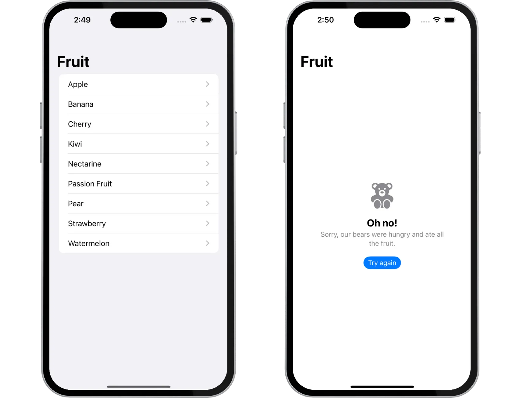
If network call fails and no data is returned, we show a custom view, which in this case is a Label, custom description, and an action. Both description and action are optional in the above initializer.

You can also use more simple initializer with title, an optional description and an optional image. You don’t need to create custom views, but there’s the flexibility of customization.
All strings are localizable as well, just like any other view component. If you’re using the initializer with a title and an image, title is a
LocalizedStringKey.
Final Thoughts
ContentUnavailableView is great addition to the list of available SwiftUI components. You don’t have to create custom error views anymore and it’s automatically positioned in the middle of the screen. No need to add custom frames or alignment.
Please feel free to reach out on X (Twitter) or Mastodon if you have any questions, comments, or feedback.
Thank you for reading and happy coding!
